Sky
Monika & Bohuš Kubinskí
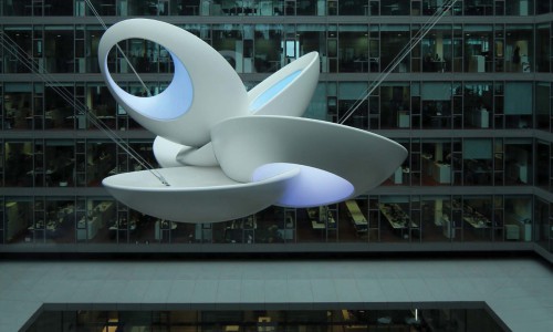
HEAD OFFICE OF SLOVENSKÁ SPORITELNA - Bratislava
fiberglass - LED lighting - hang up system
10 x 10 x 8m
2011 - 2013
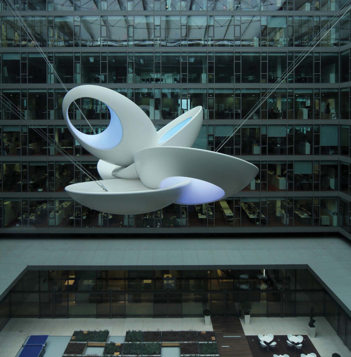
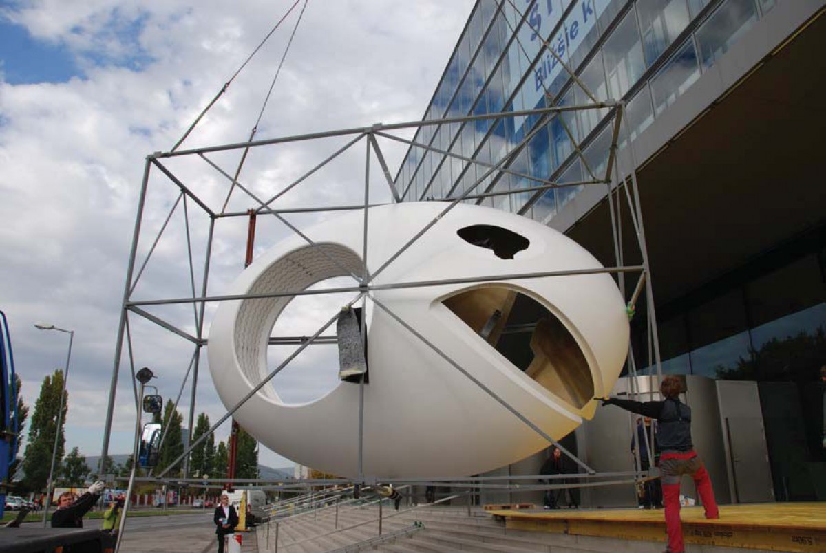
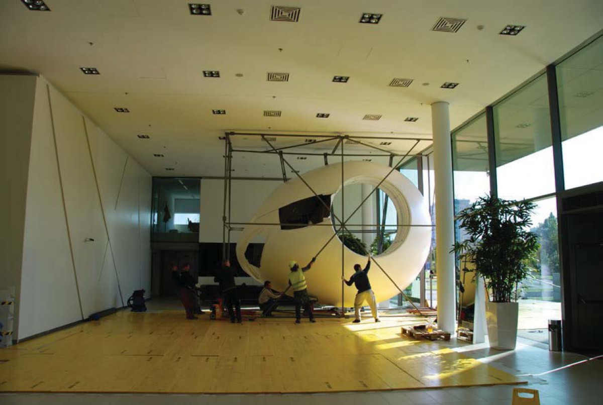
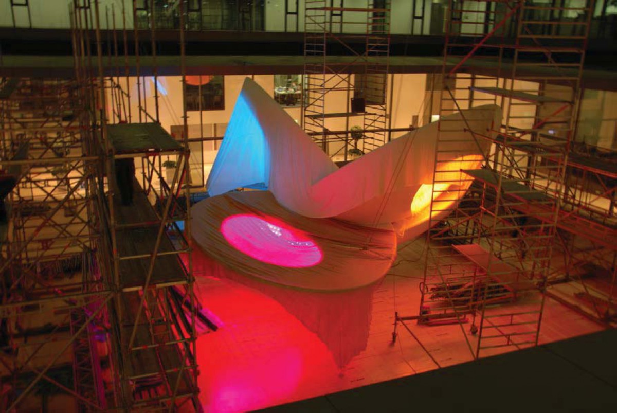
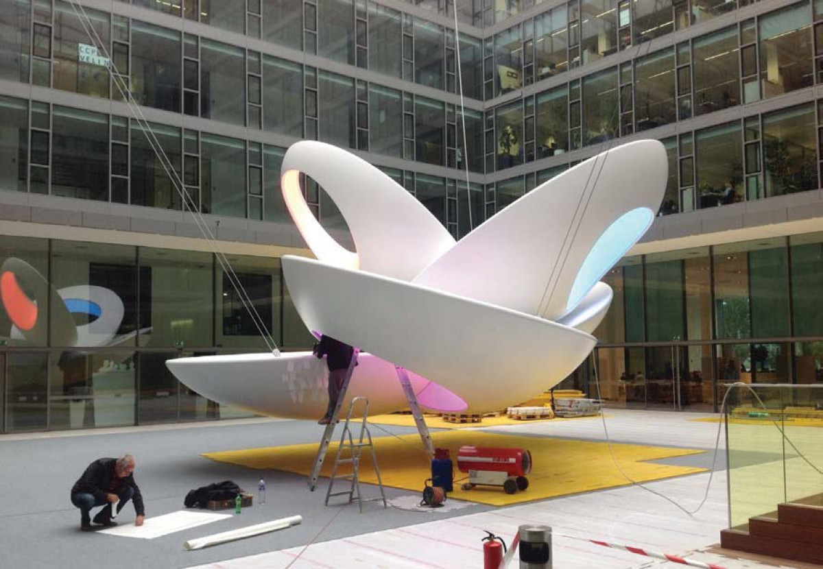
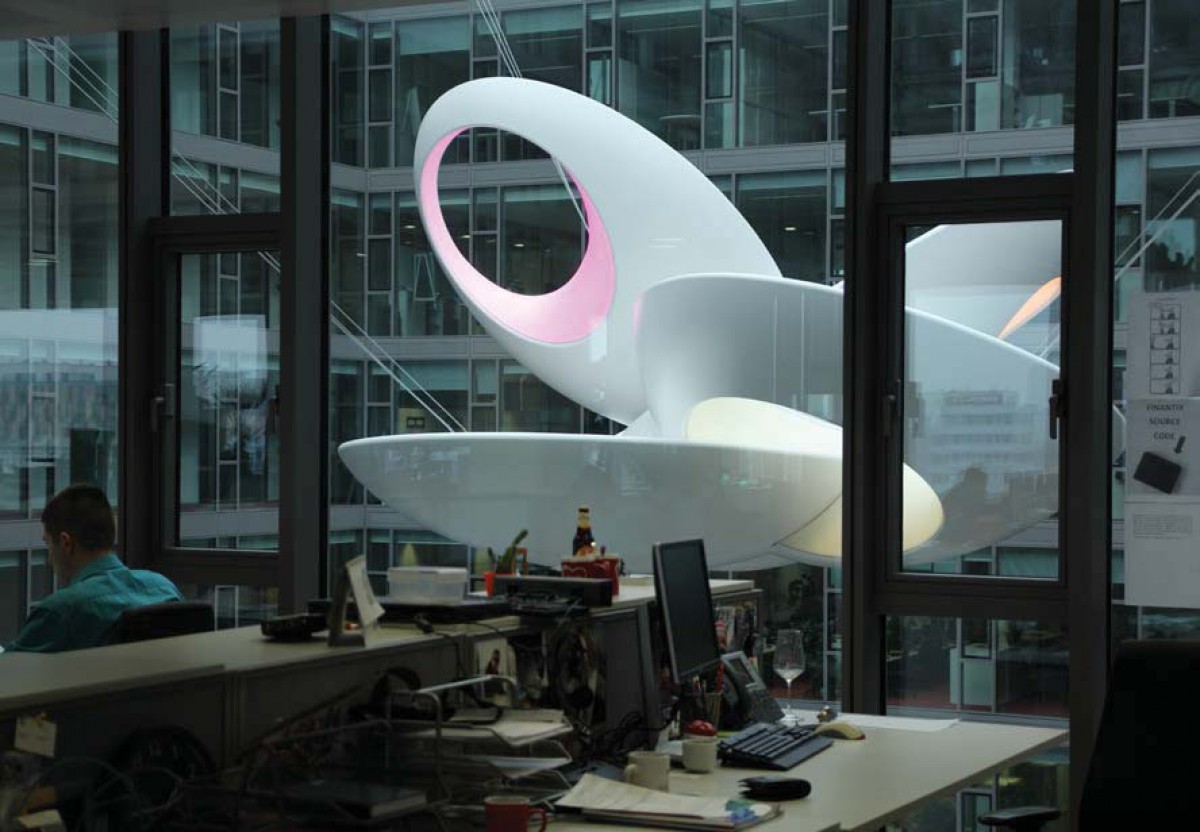
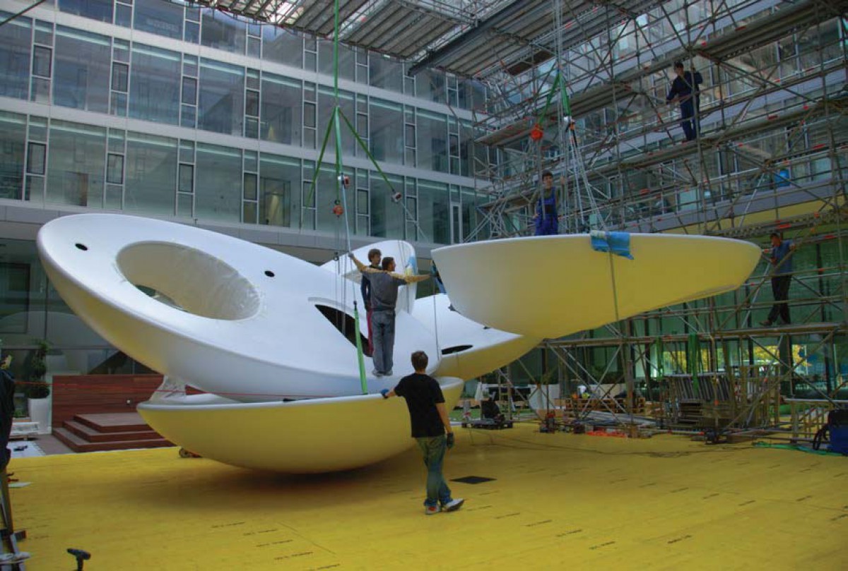
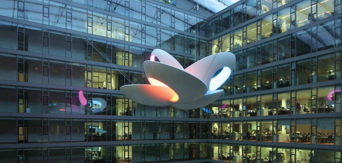
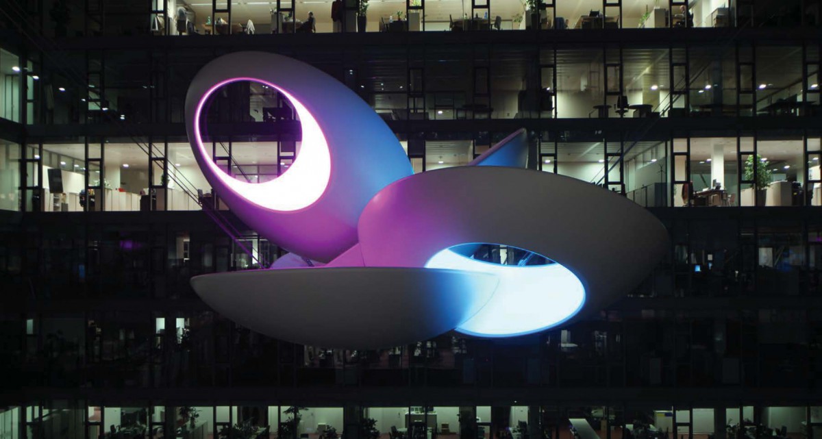
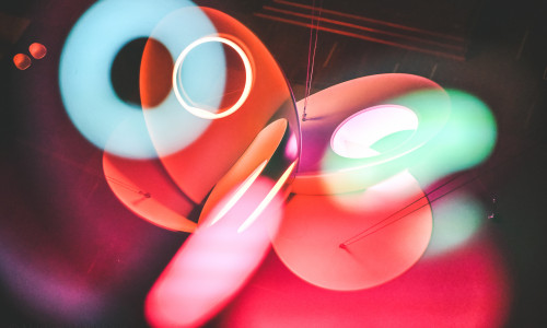
The artwork of the couple Monika and Bohuš Kubinský vehemently communicates its presence. A huge white organic-shaped form, which— while floating high above the heads of the people below—has complemented the inside atrium of the office building of Slovenská sporiteľna at Tomášikova street in Bratislava. The sculpture called “Sky” hangs on wire ropes affixed at three points of the construction structure and due to its size (of more than 10 meters) it “fills up” the inner area in the centre of the closed-off four-wing building as a visual magnet. It catches the eyes of those in the nearby offices as well as those on the ground floor of the atrium that is used for “free-time” activities of the employees or for occasional social events. The sculpture is the “product” of the cohesive authors' strategy of the Kubinský couple; it has evolved from the preceding artwork series; morphologically it is a continuation of the older sculpture works by Bohuš Kubinský—desert flowers chiselled from white Carrara marble; and as to the motif, it is close to several similarly spectacular “cross-media” installations that the couple have done together. “Sky” has acquired a sculpturally pure look, cleverly depicted using advanced software simulation and expressively modelled using “non-sculptural” materials such as laminate rein- forced with inbuilt steel construction and transparent Barrisol foil through which colourful lights from LED sources are filtered. This explicitly construction-like repertoire may give a rather confus- ing impression by rendering the artwork the character of functional design. However, “Sky” is a work of art through and through; it nobly reveals its “artistic function”, spinning the traditional dialog partnership of “sculptures and architecture”. The dialogue is held in both harmonic and confrontational manner: on one hand, it is the outer appearance which in its form, colour or composition is in contrast with the strict architectonic scope of the building. On the other hand, there is the logic of the inner build of the artwork, which, similarly to the headquarters building, exploits the creative potential of high-tech, applies sophisticated materials and explores the topic of digitally exposed reality.
Michal Lalinský
